


Instagram redrew its logo on August 13, 2026, and people misread it on sight. The new wordmark swaps cursive loops for straighter lines, and the bent "r" now reads as a "z." Within hours, the app had a nickname it never asked for: Instagzam. The first wordmark change in a decade, and the crowd renamed the brand in an afternoon.
What To Know
- Instagram replaced its cursive wordmark on August 13, 2026, its first wordmark change since 2016.
- The gradient camera icon did not change and remains the app icon.
- The new wordmark is custom lettering drawn for Instagram, not a released font, mixing script gestures on the s, r, and g with a squared-up base.
- Meta shipped three typefaces with it: an updated Instagram Sans, a new handwriting face called Instagram Pen, and a monospace called Instagram Mono.
- The wordmark grabbed the attention, but the type system is the part that will do the real work.
The 2026 Instagram Logo: What Changed
The wordmark changed. The app icon did not. A wordmark is the text-only logo, the word "Instagram" spelled out at the top of the app, and that is the piece that got redrawn. The colorful gradient camera on your home screen is exactly the same as it was the day before. A lot of coverage has been muddy on this point, so it is worth stating flatly.
What Font Is The New Instagram Logo?
There is no font to look up. The new Instagram logo is custom lettering drawn for Instagram, so there is nothing to download and no typeface name to search. That is the answer to the question everyone is typing into Google right now. Three typefaces did ship alongside the wordmark, Instagram Sans, Instagram Pen, and Instagram Mono, and all three are proprietary to Meta, built for Instagram and not sold to anyone else. If you are hunting a look-alike for a mockup, our roundup of logo design trends is a better starting point than any single font.
Meta has not published gradient color values on its design blog or brand pages, so any hex codes circulating online came from third-party guesses rather than from Instagram. What Meta did say is that the gradient stays and that it will be used more sparingly across the identity. The color is meant to frame what people post, not to compete with it.
The rollout is staged. The wordmark is going out globally now, and the wider brand system will keep arriving through 2026 and into next year. Many readers will not see the new mark in their own app yet, because a change this size reaches app builds and marketing templates on different schedules.

The wordmark color is the one value you can pin down. The 2026 logotype is set in flat black, which reads as hex #000000 and CMYK 0, 0, 0, 100, and it reverses to white, hex #FFFFFF and CMYK 0, 0, 0, 0, on dark backgrounds. Black is the standard lockup, chosen so the letters stay clean against the gradient icon and let the photos carry the color.
Adam Mosseri, the head of Instagram, made the announcement on August 13, 2026. He posted it on Instagram and Threads and described the mark as "sharper and more modern" than the old one. The change traces back to a single post from a single afternoon.
The Type System
The wordmark took the headlines. The type system is the larger part of what shipped, and it is worth walking through on its own terms, since the wider brand refresh reaches motion and the interface as well. Meta released or updated three faces, and all of them are proprietary.
Instagram Sans is the update, not the newcomer. It first arrived in 2022, built with the UK type foundry Colophon Foundry, and it now returns with wider proportions and flatter terminals.
Sans is the workhorse of the system, carrying interface text and marketing type across the platform.
Instagram Pen is the new handwriting face. It is hand-drawn and meant for expressive text, the kind of writing that shows up in Stories and creative tools.
Instagram has turned artist handwriting into custom type before, and Pen makes that idea into a standing system font. It rolls out with the rest of the identity through 2026, so it may not be everywhere yet.
Instagram Mono is also new.
Mono is a monospace face, where every character takes the same fixed width, which suits code and any text that needs even spacing. A monospace is an unusual thing for a consumer app to publish, and putting one in the kit signals how far Meta wants this system to reach.
For readers tracking how brand identities are built, this is the layer that usually matters more than the logo, and the same pattern shows up across the logo design work worth studying.
Instagram Icon History, Stage By Stage
The icon runs on its own schedule. It kept the shape of a camera for years, moved from realism to a flat gradient in one jump, and has changed only its color since. The full before-and-after is the kind of arc our design reviews track across brands.
2010: The Polaroid Camera
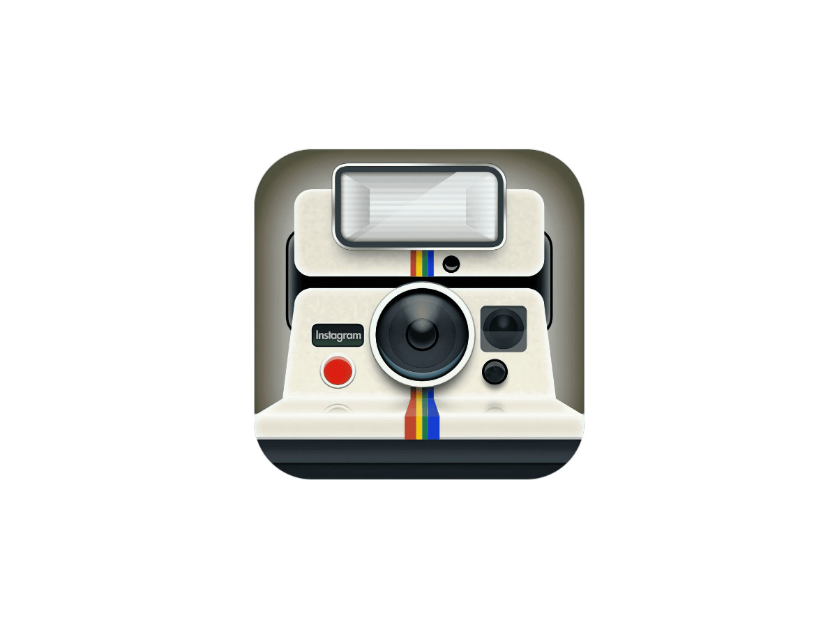
Kevin Systrom drew the first icon himself, a knock-off Polaroid instant camera with a rainbow stripe down the front, a flash across the top, and a red shutter button.
The body was a light, milky cream, and the word "Instagram" sat on a small plate below the lens. The retro look matched an app built for filtering and sharing photos.
2010 To 2011: The Bell And Howell Redesign

Later in 2010, Systrom brought in designer Cole Rise, who reshaped the icon after a 1950s Bell and Howell camera. The palette stayed beige and brown, but the shades deepened and the shapes simplified.
A vertical rainbow flag moved to the upper left, with "INST" set beneath it in uppercase sans-serif.
2011 To 2016: The Leather Refinement

Instagram v2.0 refined the same camera rather than replacing it. A leathery texture came to the upper body, the lens picked up more glossy gradient, and the color contrast rose so the whole thing looked more like a real object.
The "INST" plate became a bold "Insta" with only the first letter capitalized, and the rainbow stripe grew wider.
2016 To 2022: The Flat Gradient

2016 dropped realism entirely. The camera became a flat white outline, a rounded square holding a circle lens and a small solid dot at the top right, set on a gradient that ran from blue and purple at the top down through magenta to orange and yellow.
Users argued about it, but the shape held for years.
2022 To Now: The Brighter Gradient

The 2022 refresh kept every shape and only tuned the color. The gradient lightened and intensified, pushing more vivid magenta and pink through the same blue-to-orange run, so the icon looked brighter without changing its structure. This is the icon still on your phone, untouched by the 2026 wordmark news.
Instagram Wordmark History, Stage By Stage
Instagram's text logo has moved through six stages. The word has almost always been a script, and what changes across the years is the color, the connection between letters, and how far the cursive is allowed to loop.
2009 To 2010: Burbn

Before it was Instagram, the app was Burbn. The wordmark was the entire logo: the name set in lowercase, in a heavy rounded letterform with curved ends, black on a plain white field. Nothing else sat beside it.
2010 To 2013: The First Instagram Script

The rename brought a handwritten wordmark, drawn as neat cursive in plain black. Some letters carried elongated lines and curved tails, balanced by shorter, heavier strokes.
Not every letter joined the next, which gave the word a slightly uneven rhythm. This original mark was set in the Billabong script, an off-the-shelf font anyone could license, and it opened Instagram's script era.
2013 To 2015: The Sea-Blue Redraw

The 2013 update changed both the color and the letterforms. The script was straightened and softened into a calm sea-blue, with bolder strokes and every letter after the capital now connected. The long curved tails on the first "I" and the "G" were trimmed, so the word read as more even and professional.
Typographer Mackey Saturday drew this version, reworking the Billabong script into a logotype he wanted to sit beside names like Coca-Cola, and it became the backbone of the mark that followed.
2015 To 2016: Deeper Blue

2015 left the letterforms alone and only shifted the color. The blue went darker and deeper, which made the same script read as steadier and more confident. No shapes moved.
2016 To 2026: Back To Black

The 2016 refresh kept the script untouched but returned the color to black. Black paired more cleanly with the new bright gradient icon arriving that same year, and it let the wordmark recede so the photos carried the color.
This black cursive is the mark most people picture when they think of the old Instagram.
Read side by side, the two timelines show the marks rarely move in step. 2016 touched both at once, a black wordmark and a flat gradient icon.
2022 moved only the icon and added the Instagram Sans typeface. 2026 moves only the wordmark. The camera on your home screen has not changed since 2022.
The 2026 Redesign, Up Close

The current wordmark, live since August 13, 2026, is the first to break Instagram's fully cursive line. The base stands more upright and squared, the loops are tightened, and the script flourishes now survive mainly on the s, r, and g. The result reads as part handwriting and part sans.
The redesign and the logo mechanics are settled by now, so the interesting part is why. Jasmine Probst, director of product design at Instagram, says the team explored hundreds of directions before returning to script, including all-caps options and even literal handwriting. They came back to the cursive because too much brand equity was locked inside it to walk away from. A logo seen this often is hard to replace without losing recognition, so Instagram chose to evolve the script instead of dropping it.
Mosseri's public reason was plain. He said the mark had not changed in a decade and was due for a refresh, which struck some critics as a thin rationale for touching something this valuable.
Probst gave the design logic: "Script reflects individuality, so referencing that felt right." May Hartono, director of brand design at Meta, framed the wider system around the user, saying it "puts our community's creativity and self-expression front and center."
The obvious question is why keep script at all if you are going to straighten it out. The hybrid is trying to hold two things at once, the warmth of handwriting and the discipline of a modern sans, inside a single word. Whether those goals actually fit together is what the reaction has been fighting about.
The joke arrived fast. The new "r" drops its upright stem for a cursive loop, so the eye finishes the shape as a "z" and reads "Instagzam."
The way the letters connect makes that misreading easy to fall into, especially at small sizes. Other branded accounts piled on with mock announcements of their own, and the nickname spread within hours.
The more useful split is among designers, not commenters. The design community divided down the middle: some were relieved to see the wobbly old cursive tidied up, while others were unconvinced by a mark that is half script and half sans.
That disagreement is the real story, because it is about whether the hybrid works, not about whether the "r" looks funny. It is also the kind of argument that follows every major tech rebrand, from the Xbox identity refresh to the reactions that greeted ChatGPT and CapCut as their brands matured.
Here is the argument worth making. The wordmark absorbed all the attention, and the type system will do all the actual work. Instagram Sans, Pen, and Mono will shape captions and creator tools long after the Instagzam jokes fade.
A mark that billions of people misread is either a legibility failure or a very cheap way to get the whole internet talking about your brand for a week. Getting a wordmark to survive that kind of scrutiny is exactly what branding agencies are hired for. Both readings can be true at the same time.
So the verdict is not really about the "r." Instagram spent its rarest asset, a decade of stability, on a change most people will judge in the two seconds it takes to misread a letter.
Was making the name harder to read a mistake, or the most efficient ad Instagram has run in years? A wordmark that stops you and makes you look is doing its job, even when the word it makes you say is the wrong one.

Our team ranks agencies worldwide to help you find a qualified partner. Visit our Agency Directory for the Top Logo Design Companies as well as:


